This is my favorite hair salon
Classy, elegant, and located in a beautiful historic home…


…and this is their current website.

Let’s break it down
The salon’s website is incredibly outdated and hard to navigate with illegible text and cluttered backgrounds.
One of the website’s biggest flaws is its horror vacui, a tendency to favor filling blank spaces with objects and elements over leaving spaces blank or empty. Everywhere you look, there is a heavy textured pattern with grunge overlays. From the patterned wallpaper, to the chandelier silhouette, to the gaudy gold frame, there is nowhere on this screen for your eye to rest.
This also creates a low signal to noise ratio, the ratio of relevant to irrelevant information in a display. These textures not only make the website overwhelming and stressful to look at, but they also negatively impact the website’s legibility. There are at least six different typefaces on this homepage and the thin script typeface they used for their main navigation is incredibly hard to read, especially on this background.
The image they chose is incredibly outdated and I don’t believe it is representative of their target market or the work they most frequently do. Another problem I see in this website homepage is the placement and organization of the menu items. Having them aligned vertically in the middle of the page is counterintuitive to where people expect to find a menu, thus creating an interference effect, a phenomenon in which mental processing is made slower and less accurate by competing mental processes.
What I changed
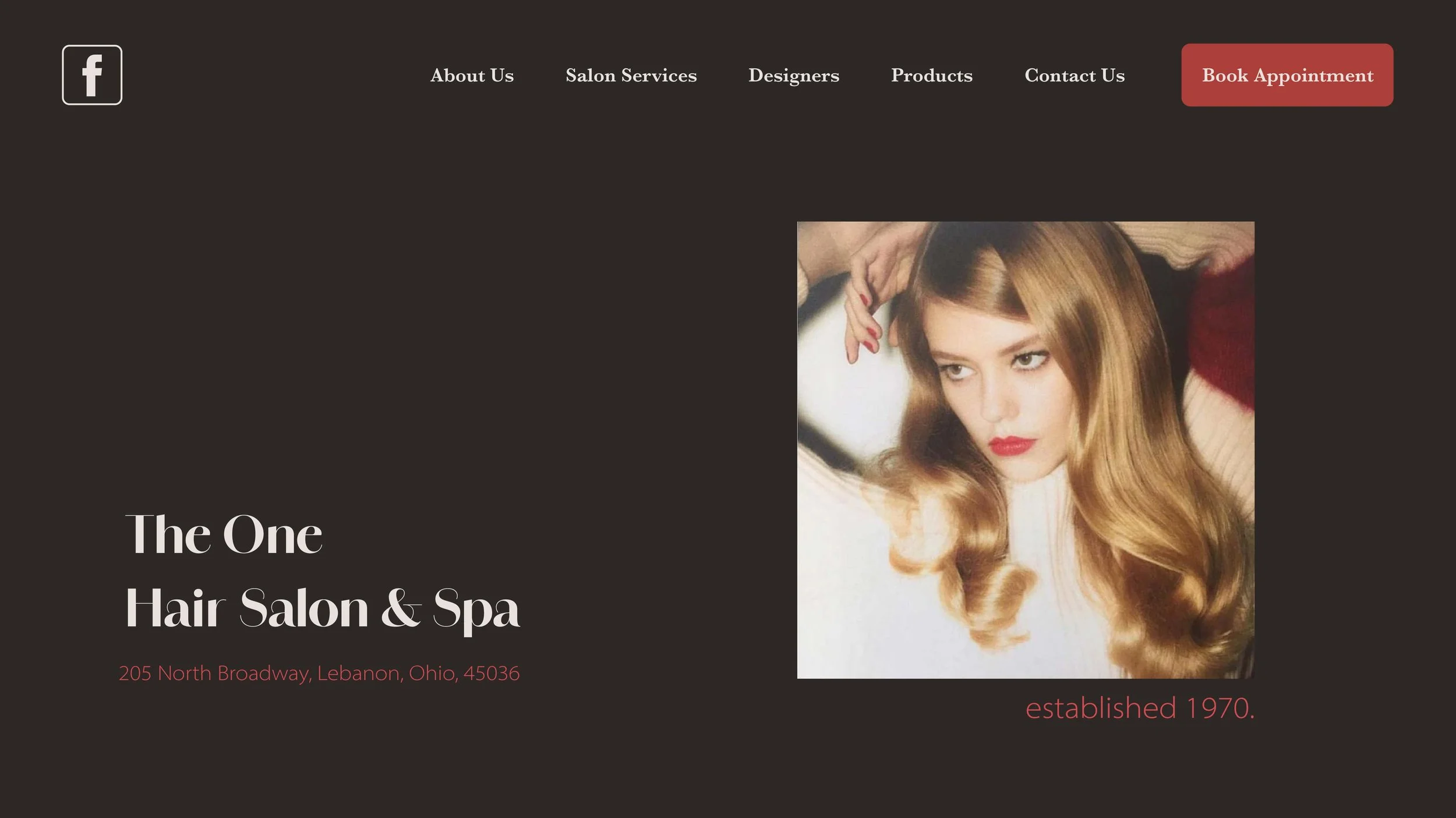
The first thing I did was raise the signal to noise ratio by using a solid, dark background. I chose this minimal and elegant color because the facility’s interior design is very classy with lots of white and black. However, I wanted to make things as legible as possible so I decided to not go with a pure black and white.
The image I chose is a more accurate example of the work they currently do and it highlights hair as the focus of this business.
I pulled red from the image to highlight and create emphasis on important information. I wanted “Book Appointment” to have high visibility because this is the main function of their website and I always struggled to find the button. Now, it is highlighted and clearly visible for easy access and usability. To combat the interference effect caused by the vertical menu items, I reorganized them to be horizontal, aligned at the top right of the page, where people will expect to find them.
